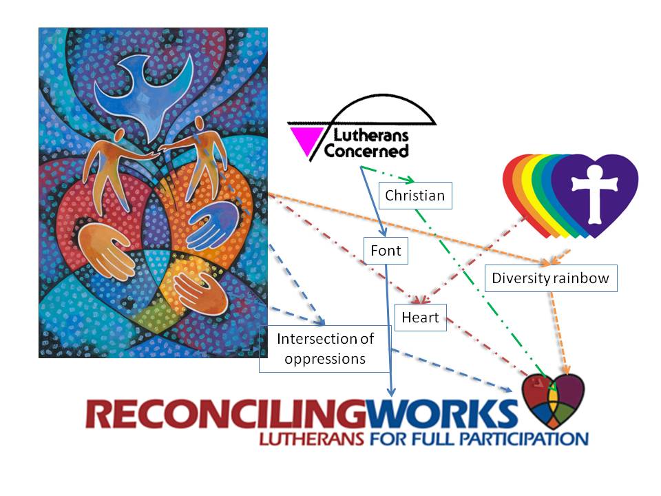
Where did the new logo come from?
In every case, when an organization re-brands itself, there is an effort to preserve recognizable portions of the previous identity so that the new is seen as a transition and as much of the value in the built-up credibility of the organization is brought into the new identity.
Such an effort went into the elements of the ReconcilingWorks logo.
Between each of our assemblies, a work of art is commissioned, containing elements depicting our concepts, values, work, and principles, from which entire discussions— sermons even—about us can be derived. The color palette from the artwork becomes the color palette used for publications and the color scheme on the website, for instance. You see the artwork from which the logo derives depicted above on the left.
The font of the words “Lutherans Concerned” was preserved. Eras is a font with an excellent history of visually connoting strength through the solid perception of its letters, as well as activity, movement, energy, and forward motion because of its 3% slant. We kept it.
The heart, seen as the symbol of the Reconciling In Christ program that sits at the center of what we do as advocacy and outreach, was incorporated into the logo, enshrining the principles and never-ending work of reconciling into our new identity.
The fish, used as a symbol of Christianity from the beginnings of Christ’s church, found painted on ancient walls as graffiti denoting the presence of the early church and followers of Christ in the locale, was in our previous identity and was brought forward into our new identity.
The intersecting lines in the artwork, reflecting the intersection of oppressions as the locus of our work, whether on full inclusion of LGBT people, on anti-racism, or any of the other-isms that beset people in society and the church, come into the logo in the intersecting lines in the heart. And yes, the Christian symbol is crossed by those lines because even the church is not exempt from being oppressive and discriminatory.
The diversity of colors in the new logo is reflective of the harmonious rainbowdiversity we seek in the world, society, and the church.
This, then, is our new identity and symbol as ReconcilingWorks.
